UX case study: Making resumes easier
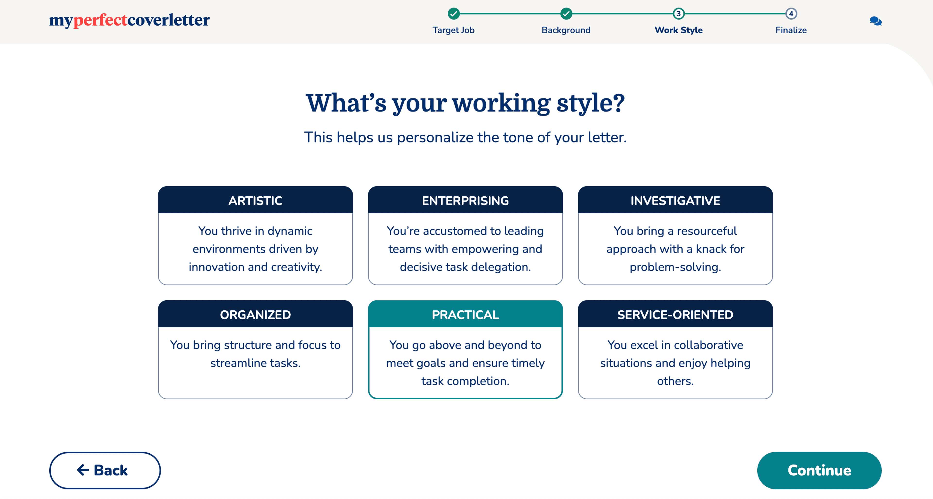
Online resume builders are tricky beasts: there's a lot of back-end complexity, but the selling point for job seekers is that they'll make your life easier. Here are two solutions we developed for My Perfect Resume and My Perfect Cover Letter. The challenge was to make this as simple (and friendly) as possible given the steps required. The funnel takes users through a resume edit, suggested jobs from job boards, AND further customized resume improvement suggestions based on the jobs they're targeting. In the case of the cover letter builder, I created descriptions for the candidates' "working styles" that helped create customized letters with the right voice and tone.
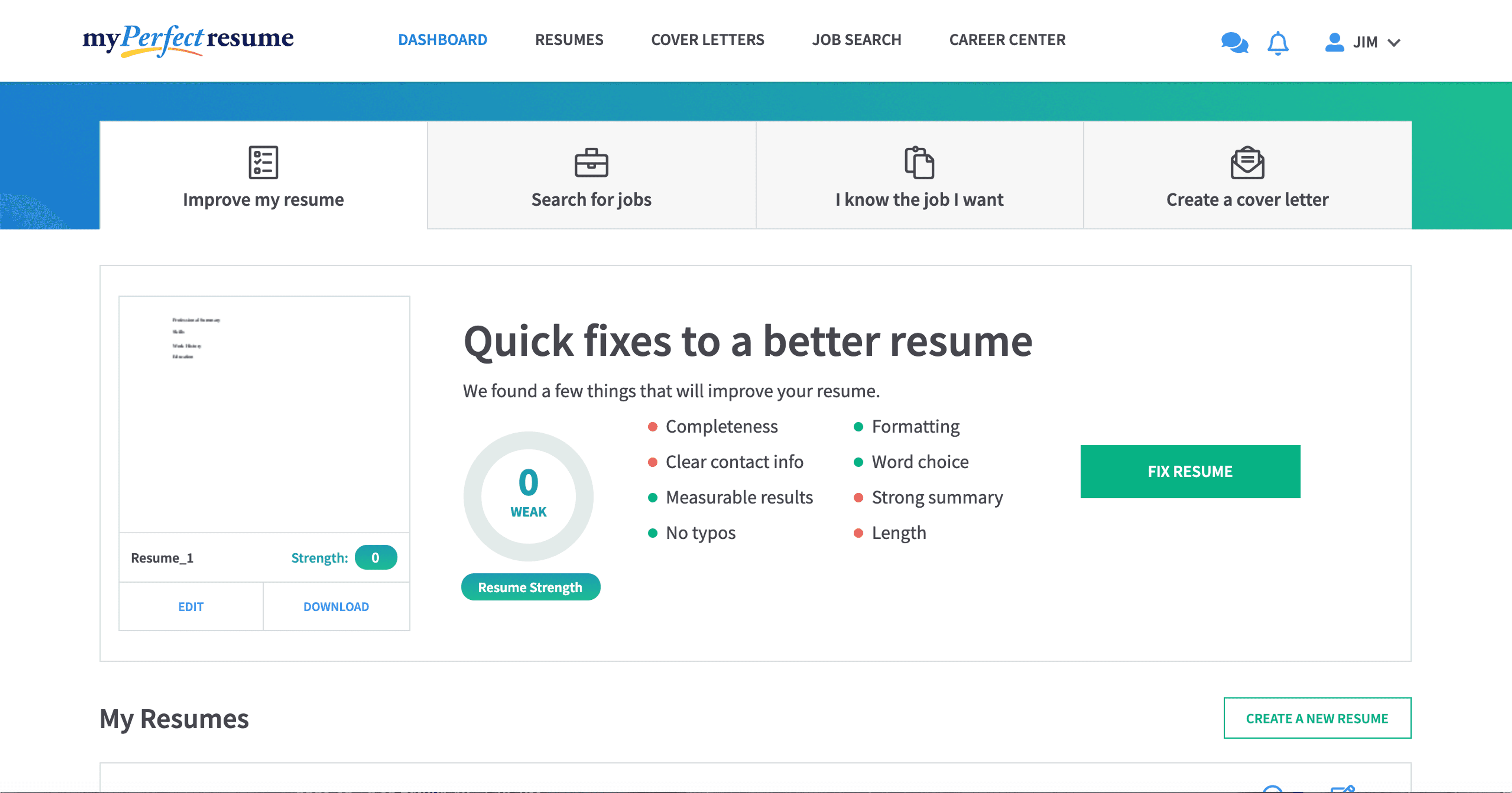
The 4 tabs at the top show multiple options for jobseekers: this is page 1, "Improve my resume."
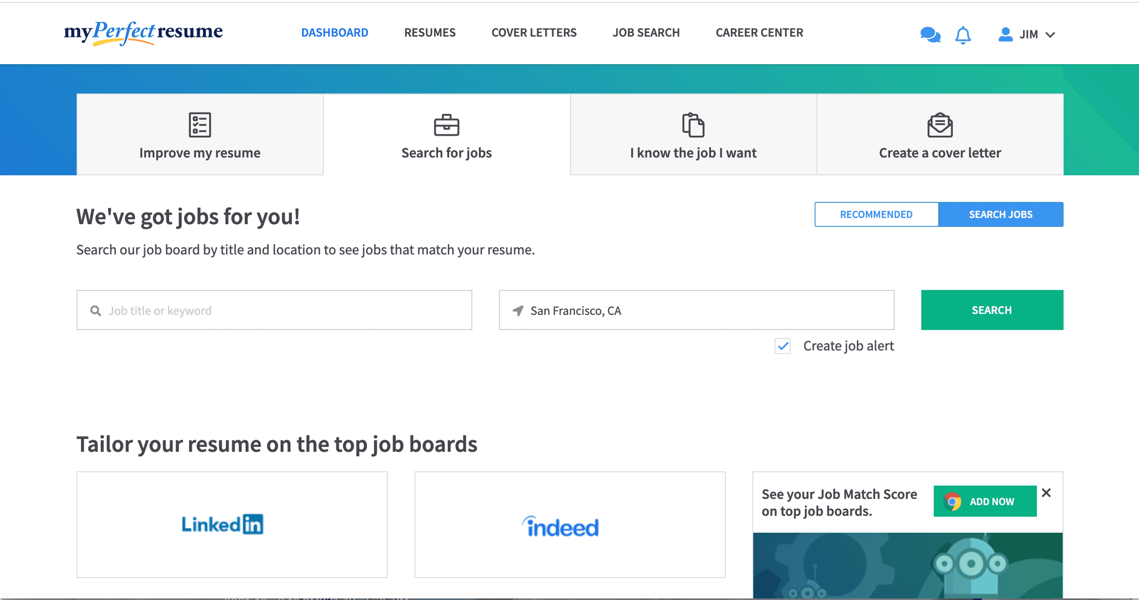
This page allows you to search for jobs, AND to tailor your resume for a job with a proprietary tool.
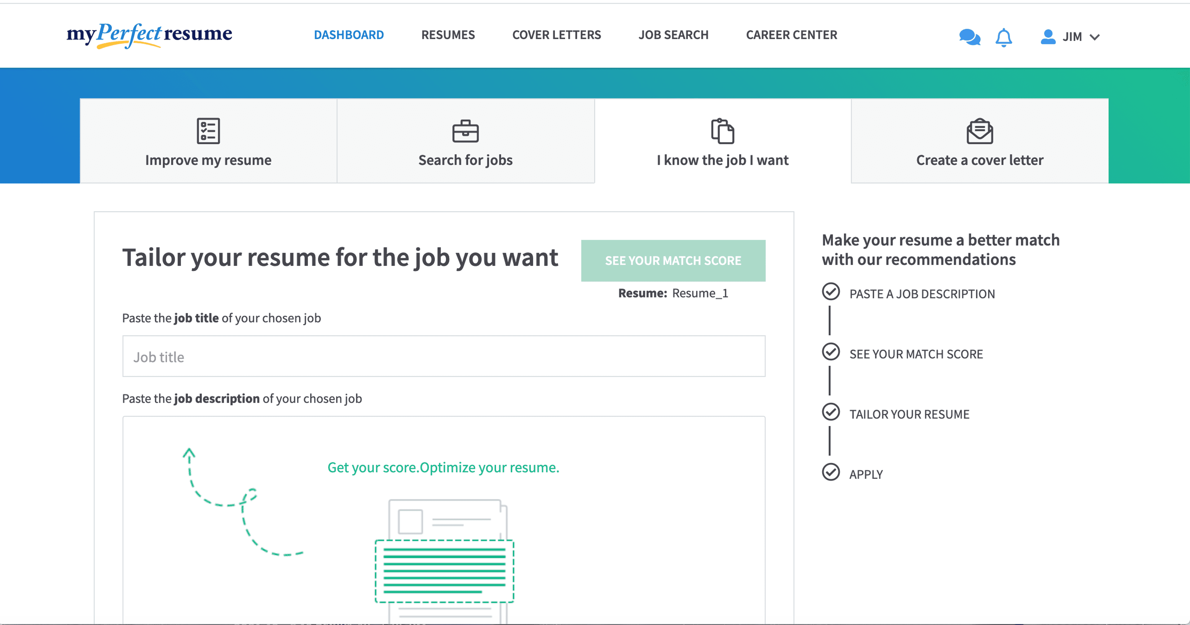
This page lets jobseekers with a job in mind edit their resume to match the job description.
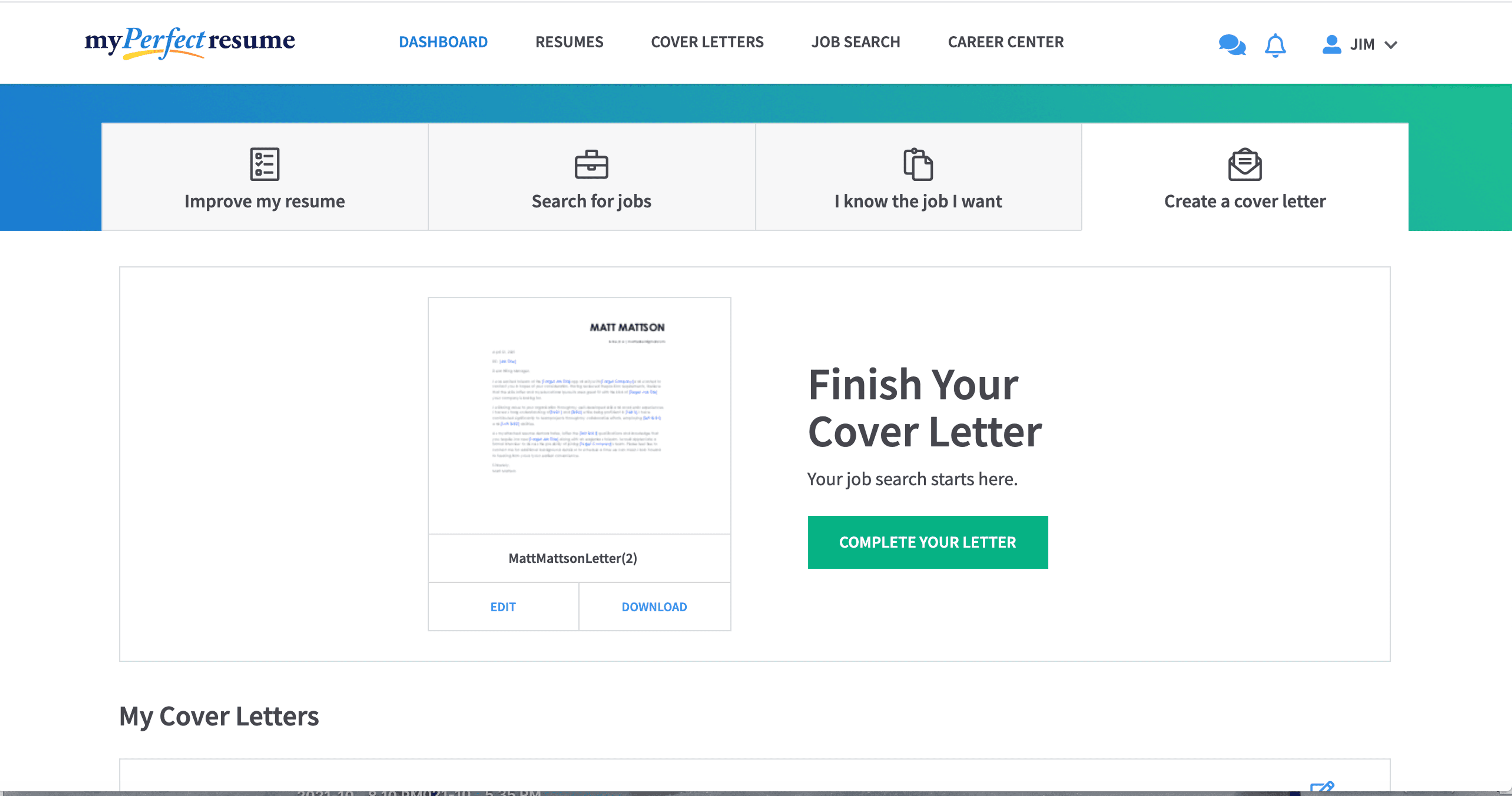
This page allows someone who has created a resume to add a pre-written and editable cover letter.
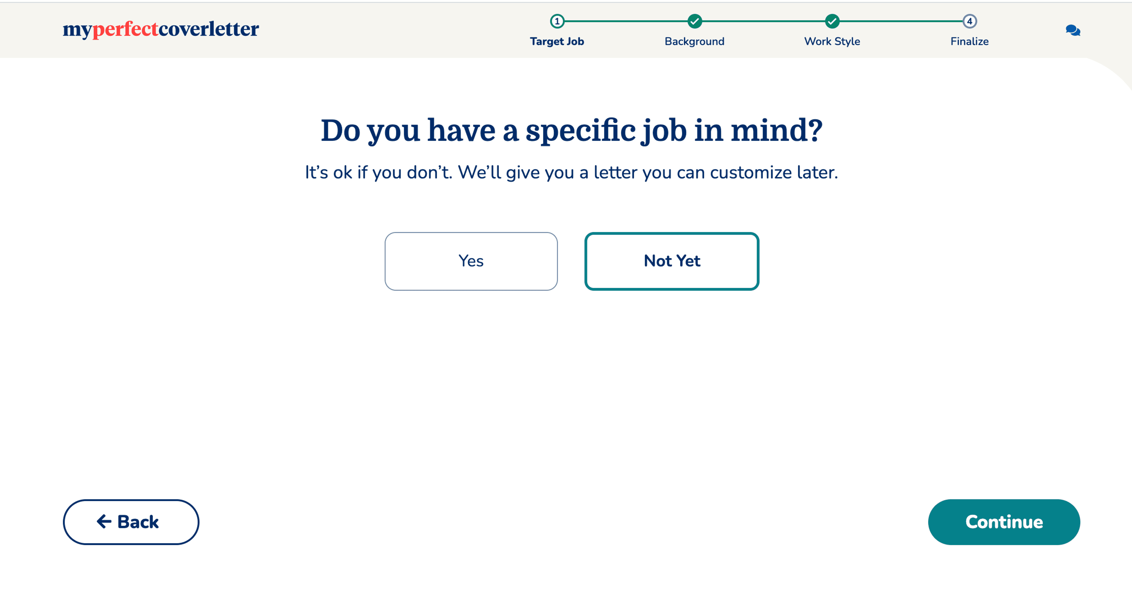
For our cover letter builder, we guide users through a process to create automatic cover letters.
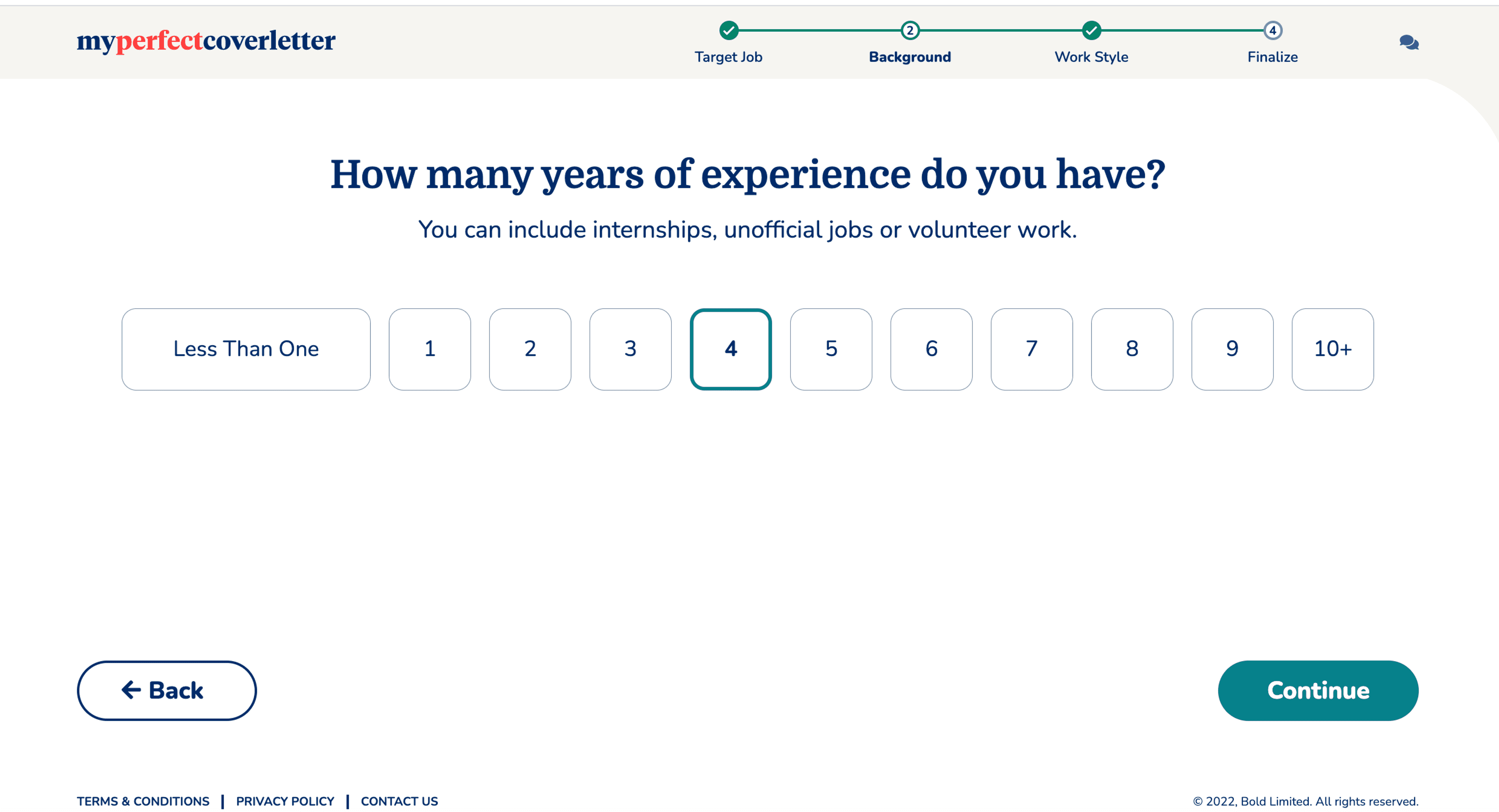
Experience comes in many forms, so we asked a general question to account for multiple definitions of "work."
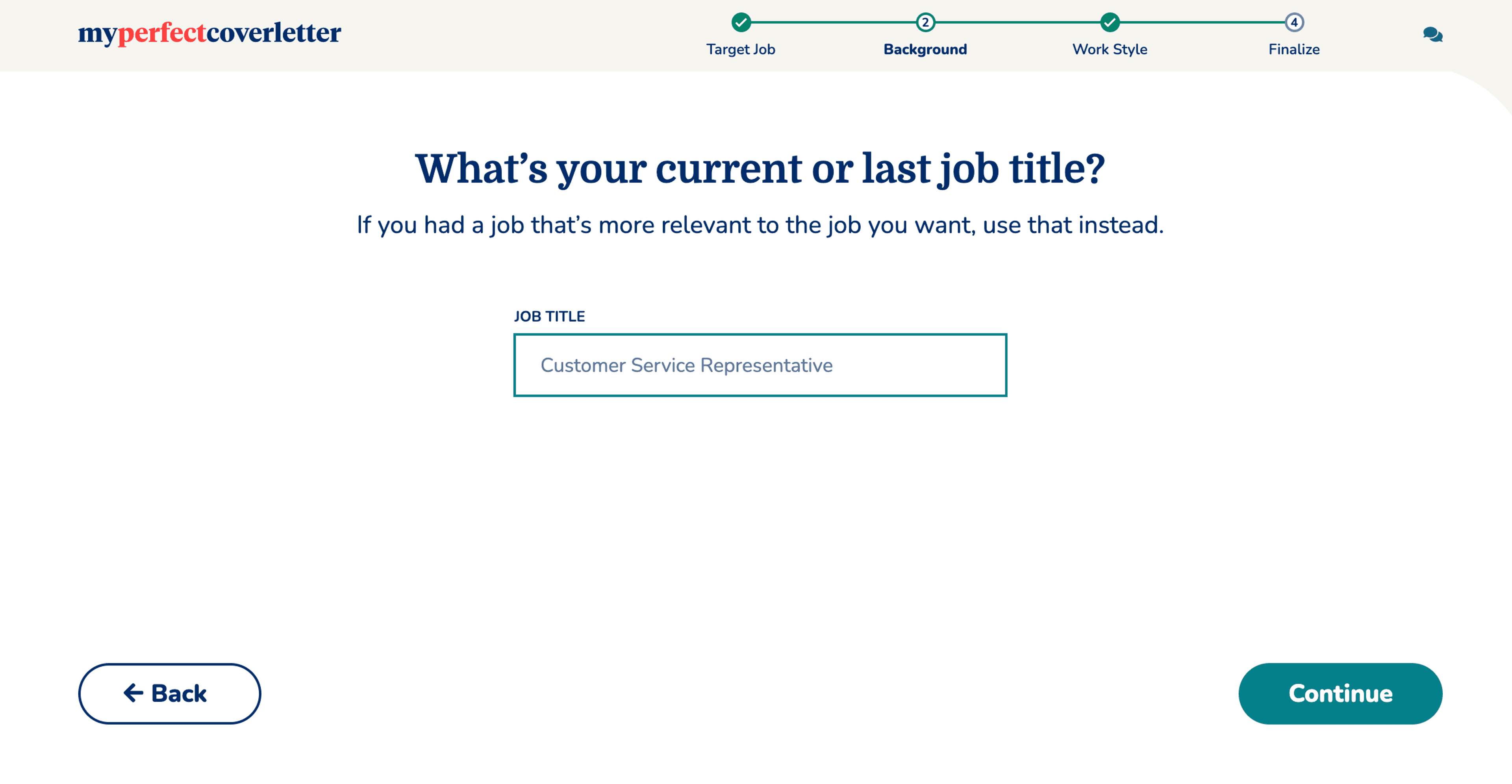
Again, giving them multiple options to help them create a letter targeted the way they want it.
For an added touch, we personalized letters based on user "work style."
